Manx News
Get the latest news from Manx.News


Thu, 16 Apr 2020
I am very conscious of the fact that many people find the seemingly constant barrage of coronavirus data simply too awful or too frightening to view. This post may not be for them, although some aspects of the map and graphs that follow are very positive.
I am also hugely aware that the information is not just ‘statistics’ but represents real people facing real threats. The loss of four lives on the Isle of Man, so far, puts the data in perspective.
For some people, the data may help us to understand what is going on in these ‘strange days’. In the graphics that follow, my aim is to help make the Island’s coronavirus data more visual and more easily understood. I recognise that the data raise as many questions as answers – especially about the real level of coronavirus given that many people with the virus may be symptomless and never tested.
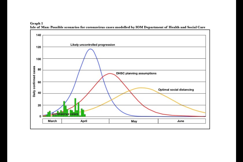
The DHSC ‘monitoring the curve’ graph is enormously important. I have produced my own version of this as the first image below. It is important because the curves indicate how the behaviour of all of us can change the pattern that the pandemic will take here in the Isle of Man. It also shows the number of new cases each day since the first positive test here on 20 March.
The government aim, as in countries across the world, is to ‘flatten the curve’ – to delay the spread of the virus so that the NHS can cope with the demand of those who fall seriously ill. If we all maintain social distancing and meet with as few people as possible we might hope to follow the flatter, orange curve on the graph. The peak of perhaps 50 new cases a day would be higher than anything we have yet seen and would undoubtedly stretch the NHS – but it would be considerably preferable to the 75 or 115 new cases per day if we followed the red or blue curves.
How are we doing so far? Well the data suggests that the ‘lockdown’, as far as it goes, may be having the required effect. On Graph 1, look at the green bar graph of actual cases each day since 20 March. We are clearly not following the blue line. Dare we hope that the apparent reduction in new cases in recent days is a good sign? Possibly - possibly not.
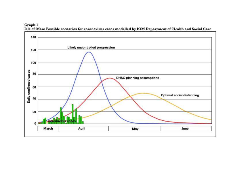
The numbers involved are small, making patterns very irregular and trends very hard to discern. Levels of testing and the return of test results vary in number from day to day. Graph 2 shows an enlarged version of the number of new cases. The highest peaks on 2 and 9 April were the two days when most tests were returned (completed). The number of completed tests exceeded 600 in each of the weeks beginning 29 March and 5 April, but in the four days between Sunday 12 and Wednesday 15 April only 161 tests were completed. It would be tempting to assume that less testing accounts for the apparent drop in new cases. The number of people waiting for test results on 15 April (155) is the highest for a week and when these results come through they are likely to bring an increase in confirmed cases. On the other hand, the number of people waiting to be tested (66) is much lower than the average of over 150 during the period between 30 March and 5 April.
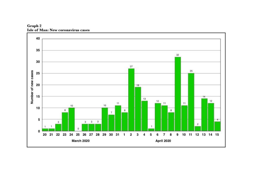
There is much international debate about when a sufferer can be said to be clear of the virus, and whether people can catch the virus a second time. The Manx government’s twice daily briefings include a figure for persons ‘presumed recovered’ from the disease. Graph 3 shows the total number of confirmed cases in the Isle of Man (254 on 15 April) and the number of those who are presumed to have recovered (151 on 15 April) – or almost 60%). This is a very positive reminder that most people affected by the virus have already come through it.
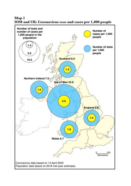
This map is based on data reported for Tuesday 14 April. It shows very clearly that the Isle of Man has a much higher level of testing (shown in blue) than the four countries that make up the UK. The Isle of Man’s 2,064 completed tests in a population of approximately 84,000 amounts to nearly 25 tests per 1,000 people. The UK countries range from under 6 (England) to 7 (Northern Ireland) per 1,000 people. Testing in the Isle of Man is 3 to 4 times higher than in the UK countries.
The number of cases in the Isle of Man (shown in yellow) appears to be high. The 254 confirmed cases in a population of 84,000 amounts to 3 per thousand. This is higher than in the other UK countries but is simply the result of the higher level of testing in the Isle of Man.
I have not attempted to analyse the number of deaths on the Island – remember these are not just statistics. The numbers in relation to population size are very much lower than the UK (by a factor of 7 or 8), but then our first confirmed coronavirus case on 20 March was three weeks after the first confirmed case in the UK.
The state of emergency in the Isle of Man has been extended to mid May. We cannot afford to ease up on our current restrictions over the next few weeks.
 Fri, 29 Dec 2023
 Fri, 29 Dec 2023
 Fri, 29 Dec 2023
 Fri, 29 Dec 2023
 Thu, 28 Dec 2023
 Thu, 28 Dec 2023
 Thu, 28 Dec 2023
 Wed, 27 Dec 2023